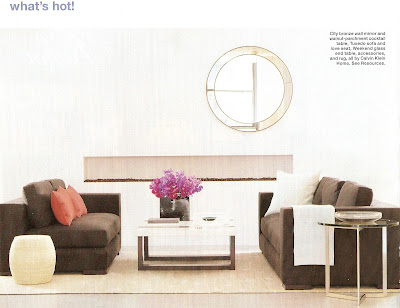
The above picture caught my eye, mostly because, in design, I am very symmetrical. I love things balanced and even. In this space, the offset mirror is what totally drew me in!
The space below, is NOT MY style. BUT, I keep going back to this picture, analyzing it, wondering how on earth could a family with a baby, live in this tiny space. I appreciate how the space is used, and I happen to love most loft design, but wow!! not enough room for me!! I also wonder, how clean does a small space like this stay, once that baby is a toddler??
Thoughts?? could you live in this tiny home? do you think its a great way to utilize the space, or too cramped?
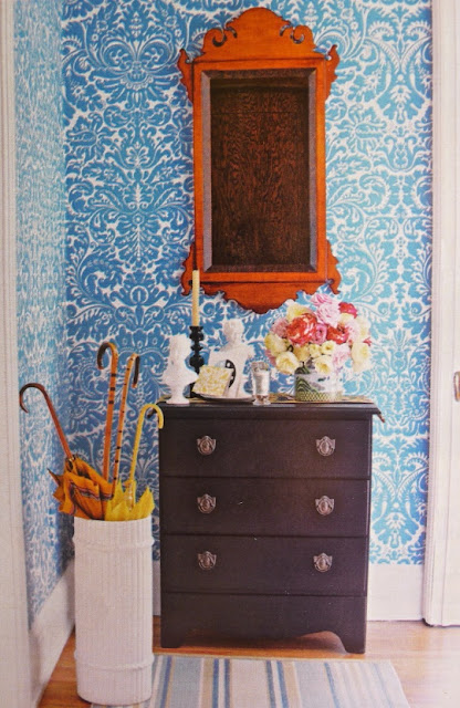
The next is, obviously, not a whole room, but the use of one piece that just POP’s in a space, is an idea that I love!! in this picture, the vibrant colored mirror, makes such a statement against the patterned wall covering, with out overwhelming the design!!
I am so drawn to it, and will for sure copy this idea in the future!
One of the greatest aspects about Design ( no matter what type it is) is that it is all personal preference, one space that gives me the heebs, may make you, your most comfortable self. So surround yourself in what makes you the happiest!!
Enjoy Your lovely Friday everyone!!


Leave a Reply